Day 21 took place over a number of days, as I've been sick with a nasty cold recently and haven't always had the energy I needed to do all my work. But I chipped away at it and this is the result. The information I am presenting is not in the order that I did it, but rather the order I can keep it all straight in my head.
My warm-up was to "listen to what nature was telling me". The book even suggested that I consult a book about nature omens. Now, I don't actually believe that there is a such thing as a nature omen, so I had to make of it what I would. It did occur to me that I don't spend a lot of time just observing nature and appreciating it. The book suggested that I do a visual journal entry about it, but I didn't even know where to begin, so I decided to go out with my camera. I figure that photography can be a kind of a journal, and I am eager to improve my photography. So I went for a walk with my camera and took pictures of nature changing for fall. I particularly liked the red red leaves and the squirrels that were so happy with their acorns.
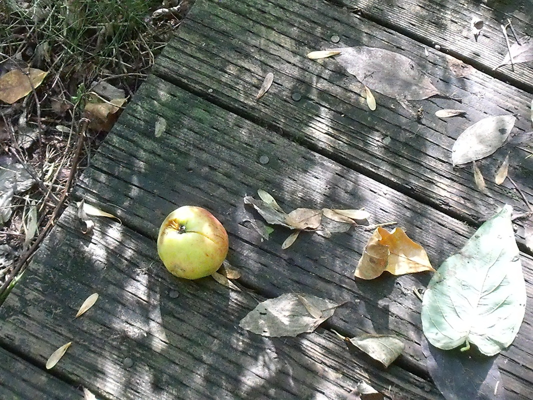
Autumn fruit.
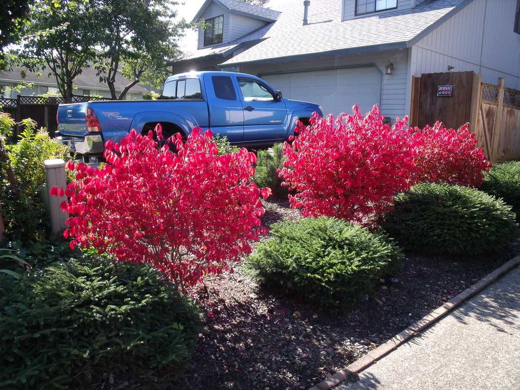
So red!
I watched a fantastic podcast about the Jawaja leather workers of India. They were doing a presentation via Skype, with a translator. Theirs was a very inspiring story. Thirty years ago, they were so low-caste that they weren't allowed to draw water from most of the wells. The traditional way of leather working in India is to scavenge for dead cows, as you're not allowed to kill a cow. So this was a despised profession. The leather workers were very poor. Their elders decided to ban the scavenging of dead cows and work on shoes (feet are kind of taboo in India) in order to raise their status. This had the unintended effect of making it even more difficult financially for the leather workers, as they had to buy processed leather, and couldn't sell as much. Eventually, they decided that they had had enough and began to work with design schools and craft councils. They helped develop products that could be marketed overseas. They began to sell to Maiwa and made enough money that they could eat twice a day (they were eating once every two days before that) and own houses. Since the presentation, customers have been so interested in the leather work that they have had to carry extra stock. Their bags and purses are very popular and they always have a large selection on their website. I was very happy to hear about the improvement of their lives and I hope they become even more prosperous. Their social standing in the village has also improved and now they are allowed to draw from all the wells. I have been working on a drawing of crumpled paper. This is going to take me a few days., I think. It requires a lot of concentration and patience. So far, I think it looks like cloth, but we will see how it looks when I am finished. I will post pictures as I have them. I watched more podcasts on the Art of Photography. The first one I watched was about scanning negatives, and it reminded me of my first full-time job as a digital scanner. It was a good refresher, and I learned about adjusting the histogram more finely than I did at work to improve detail in the photo. The next one I watched was on dynamic range, which is the range of values in a photo. Ideally there should be a wide range of values in order to show the most detail, unless you are doing high contrast on purpose. You can adjust the values in the computer to improve the range. The next one I watched was pretty cool, on tethered shooting. This is where you set up your camera to load pictures directly onto the computer so you can tell if they are exactly as you want them (it can be hard to tell on that little screen). That way you can adjust your settings to tweak the photo. This technique is used especially for catalogue photos. The final one that I watched was on time-lapse photography. It's very interesting because you have to set your camera up to take these photos at set intervals and then not touch it. You can't adjust the lighting levels or anything or it will look strange. There are programs that you can get for your computer that will play the time-lapse and you can make a little video. In my design book, I reviewed the chapters on shape and texture. In surface design, I am proud to say that I have my bolt of cloth! I have spent the last couple of days preparing the cloth and have cut the pieces for the order for my brother. I have also been working on dyeing some other pieces that I was experimenting on, and I am washing out those pieces now. It doesn't sound like I've done a lot but preparing an entire bolt of cloth takes a long time!
I sort of did this day over the span of two days. Yesterday was a holiday (Columbus Day in the US and Thanksgiving in Canada) so I only did a little work. Also, I'm having trouble with my productivity lately. I am learning stuff but not at the rate I would like. So I will see if I can ramp things up a bit over the coming week. I listened to two podcasts yesterday. The first one was about a Shibori artist from the UK. She worked primarily with Indigo, but also with iron rust. She does beautiful, intricate shibori work, which leaves me in awe. She takes quite a lot of time very carefully stitching, dipping multiple times in the dye vat, and then carefully undoing the stitching. You can see a little of her work and the kits she sells at http://www.callishibori.co.uk/. The next podcast I listened to was by a textile designer-turned cultural anthropologist who had a little money that would either let her work in her studio for six months or allow her to travel to India to study textiles. She didn't know which one she would rather do, so she flipped a coin. The coin "chose" the trip to India. She has traveled all over India, and has specialized in studying the block printers of the Kutch region in Gujarat. She specifically studied ajrakh printing. She absolutely loves traveling in India and has arranged many exhibits in the West. For business study, I watched some more of the Art of Photography episodes. The episodes I watched were all about developing film. I won't be doing that anytime soon, but it was a fascinating process to watch. The developing fluids were poured into a little light-proof case that held the film. There were three different fluids, but I can't remember what they all were. I wonder if photographers today miss this sort of process, or if they find Photoshop gives them better control. In design, I did a review of the chapter on form, doing sketches as I went. I looked at variety, balance, and dominance. It was a good review to make sure I understood the terms. I will have to give this book back to the library soon so I need to finish my review to make sure I understand all the concepts. Finally, I finished off some bookmarks, as well as a sample of a project that I am doing for my brother and sister-in-law. I worked on a few other items as well, applying the glue resist, stitching embroidery, and the tedious work of ironing everything. I find that working with cloth is half tedium and half creativity. It's a bit like cooking, where you spend half your time creating and half your time cleaning up or doing repetitive chopping or something. When I put on some music and daydream, the tedious stuff is not so bad, and I can get excited that it will lead to creative stuff. Anyways, I took some photos of my finished objects. 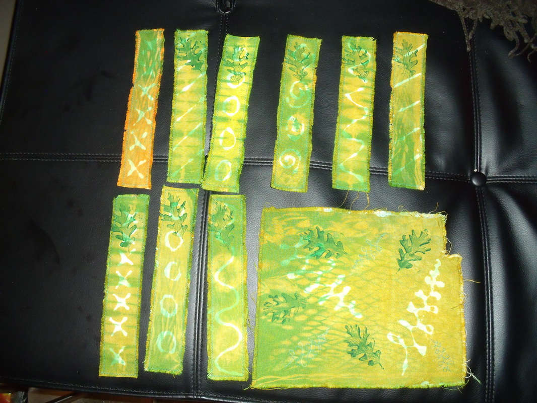 Bookmarks and sample. In the future, I will leave the leaf print off the bookmarks, as I feel that it takes away from rather than adding to the design. 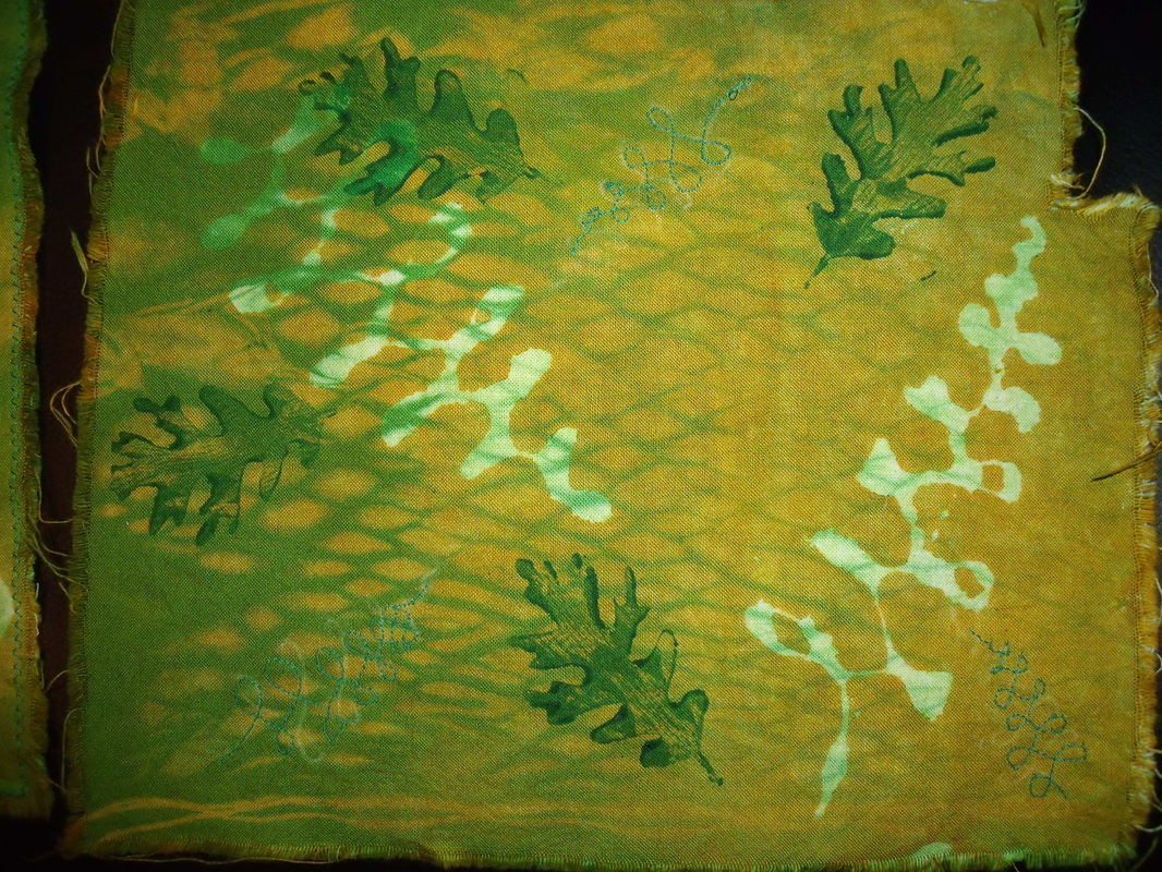 Close-up of sample. Pole wrapped and dyed, glue resisted, overdyed, printed, and machine embroidered.
Today I finished listening to the roundtable discussion on the working traveler. The travelers were asked what their favorite places were to visit, and most of them had difficulty answering, because each place was so different, and a place could change so much in a matter of a few years. They also talked about how they financed their trips. It was very interesting, because none of them were rich, but they rearranged their finances so that they could travel. It was the most important thing to them, so it was their priority. They talked very little about fiber arts at this stage, but it was interesting to hear about how they managed to travel. I hope to travel more in the future (when I have finances to rearrange!) but I don't think it will be a priority for me.
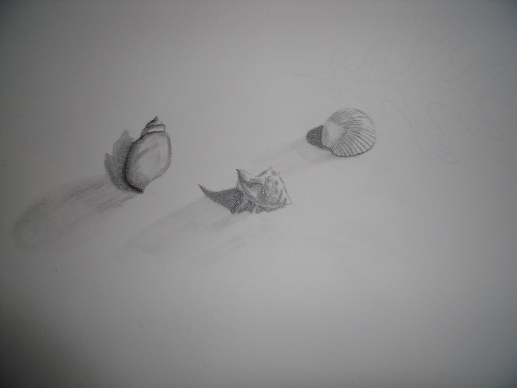
I drew some shells. I am pretty happy with how they turned out. I loved all their little ridges.
I worked on rinsing out my brown dyes from yesterday. I haven't finished rinsing them yet so I'm not sure how they've turned out. I also worked on painting with some orange dye, and doing a pole wrap and a tie-dye with the leftover dyes. I don't have pictures yet but I will post them as soon as I have them.
Short post today! Hope you enjoyed!
Yesterday, I had a great experience with my friend Amber. We sort of had a skills-exchange party. Amber showed me some things about sewing and I showed her some things about knitting. We had a great day. I made a pillowcase, which doesn't actually fit any of our pillows. I know how to do it now though. Not difficult at all. From soup to nuts I think it took me under an hour. We also worked on a skirt (just the muslin, I don't intend to wear it). Anyways, I had such problems with the pattern and the book that I think I am going to quit this one and make something else instead. I have another book that the pillow pattern comes from, which might be a better fit for me. Also, Amber left some patterns for me to try, so I'm going to give those a whirl. I hope we can have another skills exchange party again soon!
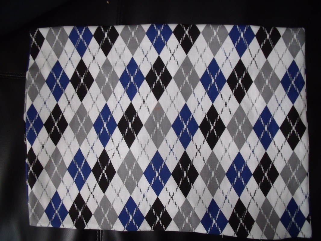
The front of my pillowcase. I like argyle.
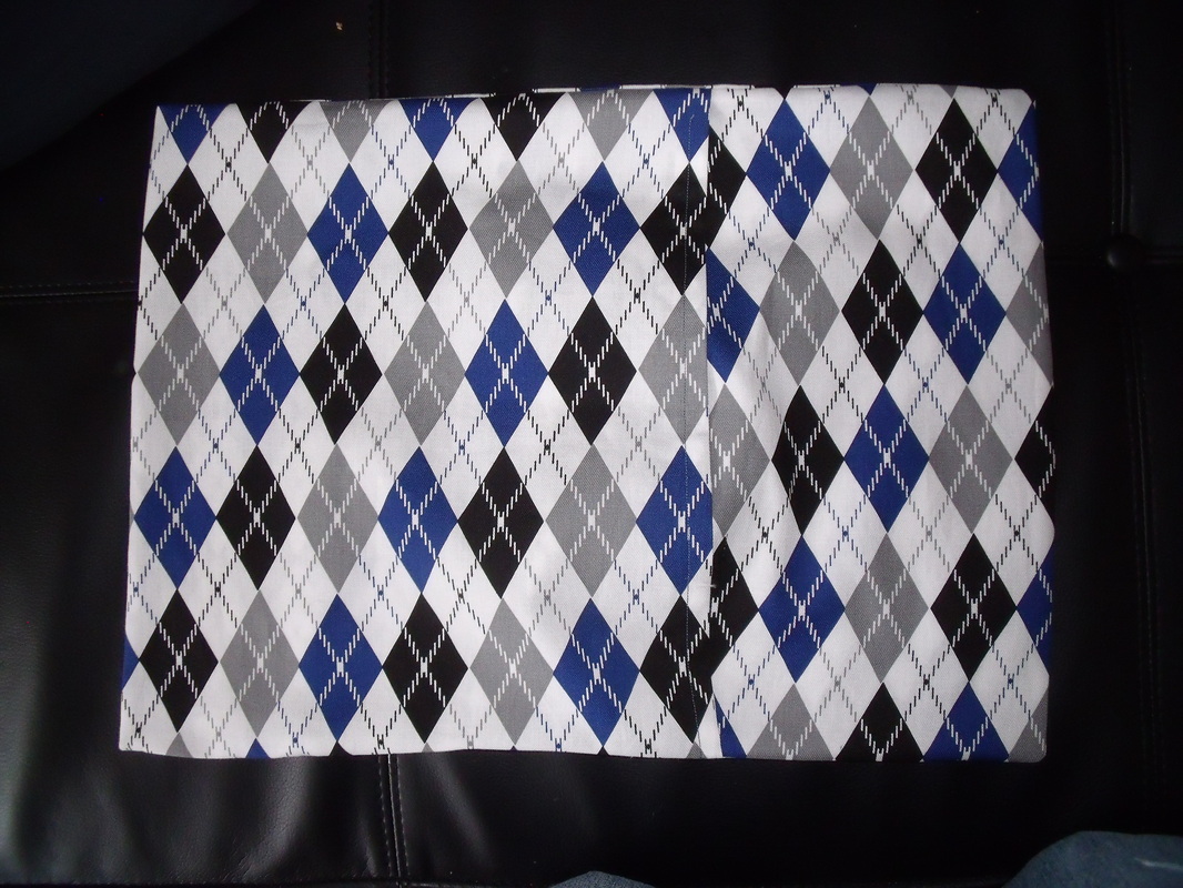
The back, with envelope opening showing. That's how you get the pillow in.
For my business study today, I watched four more episodes on The Art of Photography. The first episode was on filters, which are more appropriate for film cameras than digital. With digital, it is more effective to use Photoshop than a filter. The second episode was on metering without a light meter, which involved changing the aperture and the f-stop. I also learned that lots of photographers take slightly darker and lighter photos to make sure that at least one turns out as they had hoped. The third was on a photographer who put together a book called The Americans, and had sort of a photojournalistic style. Finally, the last one was about composition, and there were many elements to it other than the rule of thirds. One thing that stood out was the use of triangles, often creating points with eyes. Most of these triangles were right-angle triangles. Another think I liked was the use of curves in photos, usually on one of the stress points created by the thirds. I finished the last chapter in my design book, and will be going back to invent exercises for each chapter to make sure that I have grasped the concepts. This last chapter was on time and motion. It was a pretty short pattern. Motions on the picture frame are intended to slow down the gaze of the viewer, who will usually try to look at something quickly. Motion can be implied by line direction or shape position. The sequencing of images gave rise to animation and moving pictures. Some artists, such as the Cubists, tried to give the impression of moving around the subject by showing multiple viewpoints. This can be seen in Cezanne's works, where parts of the table don't line up and where some objects are viewed head-on and others are viewed from above. Sometimes images are superimposed or blurred to give the impression of moving around the subject or to suggest motion. Think of cartoons in which the character runs, and his feet turn into multiple feet moving very quickly. The chapter has a short history of moving pictures, which I won't get into here, and also discusses video artists. Additionally, computers and multimedia can be used in art now. Motion can also be implied in three dimensional work, again by showing multiple viewpoints. Additionally, there is kinetic art, which is usually sculpture that actually moves. In dyeing today, I had an interesting experiment: trying to make brown. Theoretically, brown should be dark orange. I don't have black to add to orange (which I can make with red and yellow). What I did was to mix up some golden yellow, which is close to orange, and added a tiny bit of blue and a tinier bit of red. The dye looked pretty brown but it seemed a bit on the orange side when I painted it on. I won't know exactly what the color will be until I've washed out the dye. I am hoping it will be brown, but I can keep mixing if not. I didn't saturate my cloth with dye so I'm hoping I can dye it once more if it's not brown enough.
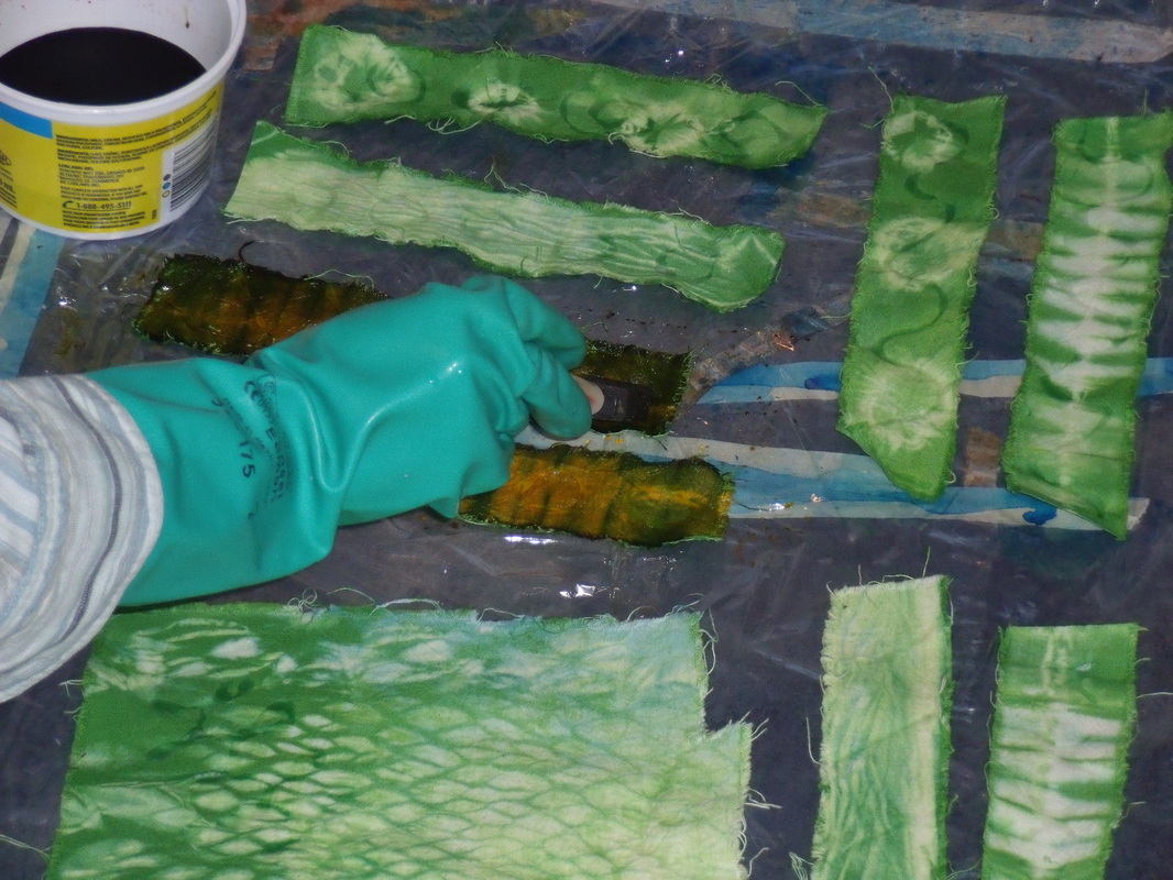
The bottom one turned out very orange. I tweaked it a bit after that.
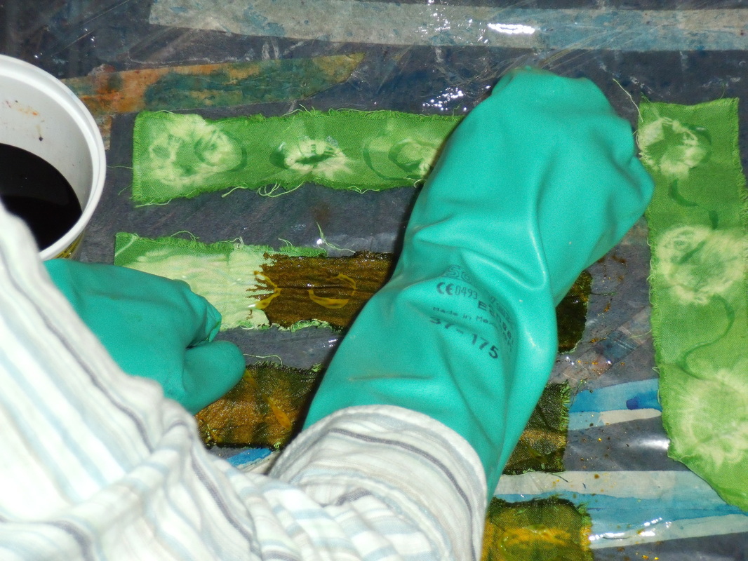
Looking browner, but still a bit orangey on the resist. We will see.
Today, I started with a warm-up to research an artist's life. The artist suggested was Frida Kahlo, which suited me fine. I'm not a Frida Kahlo fanatic, but I do like her work. Anyway, I discovered that the movie pretty much told it like it was. There were a few things in there that I didn't believe, like that she had an affair with Trotsky. Well, at least according to Wikipedia (how academically rigorous, I know) it's all true. She really was bisexual and her husband, Diego Rivera, really did have an affair with her sister. She wore long skirts because she had polio when she was a child and it deformed one of her legs. The bus accident she experienced as a teenager caused her pain throughout her life and she was frequently bedridden because of it. She became an artist after the accident (she was self-taught) and painted until her death, at age 47.
I listened to the next part of the roundtable discussion that I have been listening to lately. It was a response to audience questions, and there wasn't too much pertaining to fiber art, but more to do with traveling. They had some real horror stories about some of their travels! But there were a few important nuggets to learn, such as that unprocessed fiber isn't allowed through customs in the United States (good to know, in case I visit some sheep farms) and that there are in the world warehouses full of exquisite embroidered and woven textiles that get cut up for use in patchwork that is sold to westerners. Also, there was a plea for people to buy fewer clothes and make sure the clothes that they do buy are fair trade and, if cotton, organic, and made of natural fibers, because there is such waste in the world of textiles. This jives with my own thoughts about how people treat clothing. Some people throw clothing out. Did you know it can be reused, even if it's not wearable anymore? Old clothes are used for rags, new garments, patchwork, quilting, and rugmaking. Often clothing can be saved with a patch or some darning or a good stain remover. So think about that next time you are tempted to throw clothing away!
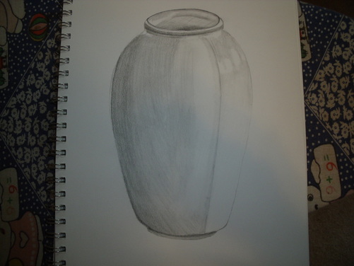
I drew a vase. Not much to say about it. My drawing was a little better than last time. I wonder how much of that is because of the practice of the last one and how much it was because my ceramic was matte instead of shiny. My vase sides are getting more even. Those of you who do not draw or paint, you don't know how difficult it is to get even sides on vases and bottles. Even arches are difficult. Usually they come out lopsided. This one is considerably less lopsided than my usual vase drawings, so I am happy about that.
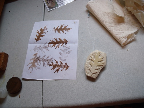
Yesterday, I washed out all my cloths. I discovered a new technique to getting the dye out without bending over it for an hour: let it soak in several changes of hot water, for about half an hour or so at a time. It worked wonderfully and I was a lot less cranky than I usually am with the process. Today I ironed them and added a glue resist to most of them. I am working on a sample for my brother and sister-in-law as well as some bookmarks. I prepared some more bookmarks for dyeing, but I didn't have enough to bother with making up some dye today. You have to use all the dye in the same session that you make it, or it won't work, so it's not worth it unless you are actually going to use it all. I would only need about a quarter of a recipe, which is too fiddly to bother with. When the resists are dry on the rest of them I will dye them all together. 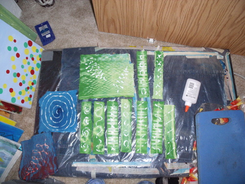 First-batch dyed cloth with school glue resists setting. The two blue ones in the corner have already had glue resists washed out of them. 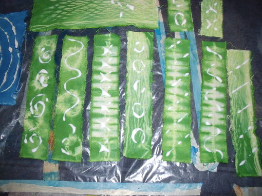 Close-up on bookmarks. From left to right, they have been tie dyed (first two), pleated, pole wrapped, pleated (next two) and pole wrapped again. 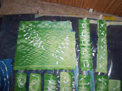 Sample and two more bookmarks. From left to right, pole wrapped, pleated, and pole wrapped again. I also designed this stamp to block print with. I modeled it on an oak leaf. 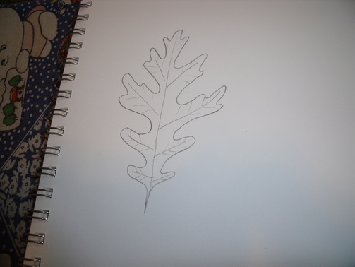 Sketch for the stamp. Oak leaves are pretty easy to draw, at least they are if you are doing a contour drawing like this.
Started a bit late this morning, but got everything done that I wanted to do. For business study, I watched more podcasts from the Art of Photography. The first one was on handheld light metering. I don't have a light meter but I can see that it might be a good investment in the future. A light meter helps you decide how to arrange your aperture and shutter speed. My camera has a built-in light meter in it, as probably does yours. When this is the case, the camera "decides" automatically on the shutter speed and aperture. Again, that's not something I have control over in my point-and-shoot but it is something to be aware of. The other two podcasts I watched were about lenses. All cameras have lenses, and most actually have more than one inside. On an SLR you can change the lenses to suit your needs. My camera doesn't have this option, but it does have settings that simulate different lenses. I don't know if these have problems with distortion or not, but I expect they would because all lenses cause some type of distortion. The trick is to get the distortion you want for your particular photo. These podcasts make me really want an SLR! But that is not an option at the moment and I can live with what I have. I haven't always been lucky enough to have any camera at all, so I can't really complain. In my design book, I studied space. I actually started studying the chapter a couple of days ago but didn't finish it until now. There is a lot of wordiness that I didn't understand in this chapter, but I understood as soon as I saw the picture illustrating it. Unfortunately, I can't show you the pictures from the book, so my words will have to do. There are two major types of space in two-dimensional art: decorative space (flat-looking surface) and plastic space (looks like it has depth). Plastic space is further divided by shallow space and deep or infinite space. Shallow space looks like the picture has some depth, but not very much. The artist might have manipulated some tricks to make the image look flat. Deep space looks like how we would actually see something in the real world (again, the artist uses tricks to make us think that it is as we would see it) and infinite space is just what it sounds like. There are spacial indicators. Sharp detail looks close to us, and diminishing detail looks far away. Larger items appear closer than smaller items. The position of a shape can make it appear closer: the horizon line is usually at eye level, so shapes below that on the canvas appear closer than shapes above it. If an item is overlapping another item, it appears closer. Transparency can be used with overlapping items to make them appear closer. Interpenetration is when planes or objects pass through each other, and depending on what is pictured, can create shallow or deep space. Fractional representation, which is seen in ancient Egyptian art, is when we picture a subject using those parts that best represent it in our heads. For example, in Egyptian paintings the head is a side view while the eye is full on, the torso faces forward but the hips and legs face the side. Converging parallels is when two sides of an object, which we know to be parallel, have sight lines pointing toward the same vanishing point. Linear perspective is a way of representing sizes and distances of objects in space. There are three major types of linear perspective: one-point, two-point, and three-point. One-point perspective has a single vanishing point in the picture, and was used frequently in Renaissance art. Two-point perspective has two vanishing points, usually located off the canvas. A view of a city might be a good example of two-point perspective. Three-point perspective is used when an exaggerated view is pictured. This can either be bird's-eye view or worm's-eye view. There are formulas for making sure that shapes in the picture will be spaced in a way that seems to suggest distance to our eyes, which I won't get into because there are so many of them. There are some disadvantages to linear perspective: it does not actually show things as we see them, you can only see things from one position in space, it can be monotonous, and the items pictured are distorted. There are other projection systems as well. Oblique projection does not have vanishing points, but does show a the side as well as the front of a shape, with the side at a 45 degree angle. It is used by engineers and architects. Isometric projection shows two sides of the object, both at 30 degree angles, as well as the top. Again, there are no vanishing points. It is used by drafters. Orthographic drawing, all objects are drawn perpendicular to a base line. It is used in engineering and industrial settings. Reverse perspective is seen in traditional East Asian art, in which the back of objects are wider than the front of them. Intuitive space is the creation of space without rules or guidelines. Lines can create space, appearing to recede or advance. Shapes can create space through overlapping. Value can create space as well: usually the lighter something is, the closer it appears, and the darker it is, the further away it seems, although this can be reversed. Texture can influence space: sharp, clear, and bold indicate closeness, and fuzzy, dull, and small textures usually suggest distance. Color can also indicate space: analogous colors create limited space, while contrasting colors create a lot of space. There is a way to create space called structured ambiguity, in which the shapes in the foreground and background seem to switch depending on what colors are around it. For this reason, beginning artists are usually encouraged not to frame their work with a black mat. Space is also crucial in three-dimensional work. Sculptures could be flat, or they could have open voids. They can be spaced apart enough that the viewer has to walk around or through them. Instillations are works that the viewer has to walk through to experience, and they use space as part of the art. I worked some more on my commissions and items for my online store. I had a lot of fairly boring work to do, involving prepping the fabric. However, I did get to do a bit of dyeing, all immersion this time. I am doing some pole-wrapped bookmarks and some tie-dyed ones. I also did a pole-wrap of a sample for the commission I am doing for my brother and his wife. They want green and brown natural-looking placemats and napkins, but they wanted to see a sample first. Fair enough: this gives me a chance to work out any kinks (like, how do I make brown?) before I start working on their actual project. I also washed out a cloth I dyed yesterday, using pleating, but it currently looks so unimpressive that I didn't bother to take a photo. I will use it to figure out how to create layers when the background color is dark.
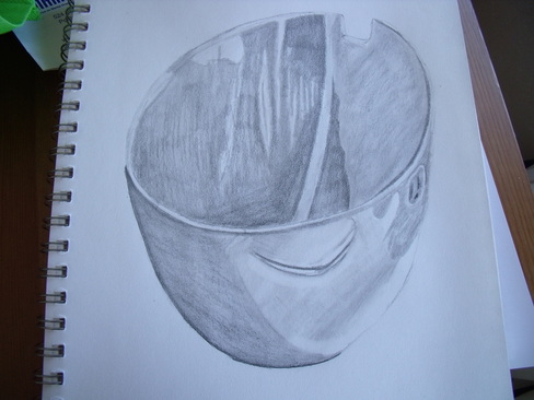
I am back in Portland for the time being, so I have access to all my stuff here. It's really nice to be around my supplies and my husband again. I had a grueling time getting back--what was supposed to be an eight hour trip (by land) became 15 1/2 hours. I spent the next couple of days recovering from that. But I am back in the swing of things now. We have decided that I will spend half my working day in study, and half in production and business. I am also happy to announce that I have made my first large sum of money! This was on the commission I had told you about earlier, for my friend Melanie. Here are the pictures of my work: 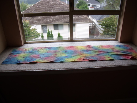 Long view. It's a table runner. 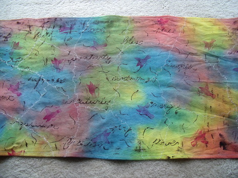 The middle. 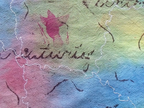 Detail. The table runner was made with a number of steps. First, I had to wash the fabric with a special soap to get all the oils and imperfections out (it was sort of a natural beige when I started). Next, I painted the fabric with liquid dye. I let it rest a couple of days and then rinsed the excess dye out (this process usually takes me about an hour). Then, I pinned the cloth to my work surface and put a flour paste over top. I wrote words and squiggles in the paste with a skewer. I let that dry for a few days and squished the hardened surface to make it crackle. I then applied a thickened dark purple dye over top with a brush, really working the dye into the cracks. After another couple of days I soaked it in warm water to remove the flour paste, and then washed it to remove the excess dye. I had to do this flour paste and dye step four times because my work surface was only so big. Next I carved out a bird stamp with safety cut lino, and used that to print the birds with textile paint. After that dried and 24 hours had passed, I heat set it with an iron. Then I sewed the white stitching on with my sewing machine and a free-motion darning foot. It took me quite a while because I spent as much time unjamming my machine as I did sewing! Then I pulled and pulled on the fabric to straighten it out (it bunched a bit when I embroidered it) and ironed it to make it flatter. Finally, I sewed all the edges so they wouldn't fray. And that, my friends, is what goes into my work! Today I started with a little warm-up. It was very similar to a warm up I had done before, in which I thought about my artistic "DNA" and why I was attracted to surface design in particular. I'm still not sure I can explain--I understand why I am into fiber arts (my mother did it, her mother did it, her mother did it, etc.) but when I tried surface design, it just felt right. It felt like what I was supposed to be doing. I can't really explain it any other way. Next, I listened to two podcast. I had heard them both before. The first one was the second part of the round-table discussion I was listening to earlier. I listened to it on the train originally but I had such an awful day that I forgot it all. It was actually still difficult to remember, because people were mostly talking about what they felt like talking about rather than having an organized topic. There was some discussion on the commercialization of textile traditions, whether it be that a peasant ask for money to be photographed in her traditional costume, or from outside companies who market a traditional craft for a little while until it ceases to be trendy. They talked a bit about going to remote locations to find crafts, and the excitement and danger that could be involved. They talked about the tragedy of collectors buying up all the crafts in one area until there were none left and no one knew how to make them anymore, and how the public sometimes doesn't understand the textiles that they are viewing. One of the panelists had to sell most of her collection of textiles in an auction because she didn't have the space to store them anymore, and not one of the people who bought the work has contacted her to find out about her research on that particular textile. She also collected many pieces for the Victoria and Albert Museum, and by the time she was finished, they were no longer interested. There have, however, been some interest by the national archives, so that is positive. The other podcast I listened to was about a clothing company called Ocelot. I had heard this podcast before but the website had pictures to go with it so I listened again. The podcast explained how the artist got into dyeing and making clothing: she was exposed to dyeing as a child, and got into costume design after college. Eventually, she became fascinated with natural dyeing and clothing construction, and seeks to create clothing that is timeless and beautiful. In her dyeing, she uses wooden blocks as physical resists. You should really check out her work because it's absolutely beautiful. Then, I drew. I drew a bowl. It was a white bowl, but that doesn't really show from the shading I did. Need to work on that shading. I was quite successful with shading in my last drawing, but it was much more difficult to depict a smooth surface. I will have to draw more white ceramic. For surface design, I am trying a glue resist with dye. It worked very well with fabric paint and now I will see how well it works for dye. I also learned how to get dye out of the carpet! Dropcloth it is then. I had loads of leftover dye so I painted dye on one piece of cloth and tried a pleated resist with another. Those will take a day or two to do their thing, so I don't know how they will all turn out yet.
My husband did some research on my behalf to investigate how to reach Canadian customers. I am focusing on Canadians right now due to my immigration status. I don't want to say too much about it, but it is possible that there may be some disruptions in the next few months, which would affect my unschooling and my business. But we don't know for sure yet. My husband also contacted customers for me and arranged deposits and such. I am very excited to have him as my business partner. He is much better at promoting me than I am, and at settling deals!
For production today, I had the rather boring task of cutting out and scouring fabric for bookmarks. I am hoping to make bookmarks an affordable way for people to buy my art. Most of my stuff isn't cheap, and I have friends who don't have a lot of money who would like to partake. I thought this would be a good way, since I can't lower my prices. I just pay myself a little over minimum wage, so I don't listen to any complaints about the prices being too high!
That's it for the day. I'm off to eat dinner and meditate.
I started my day by checking out some photos on Etsy to try to figure out how I can take better photos. I have some tips: photos look best when taken in sunlight (although not directly in a sunbeam) and on a natural surface. I have a little space in my dining room that will do the trick. I hope to work on those photos again soon.
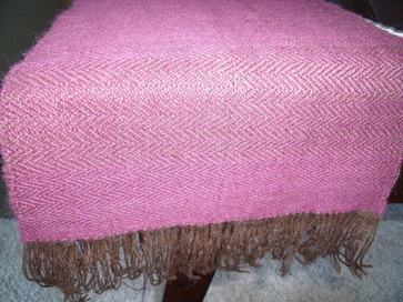
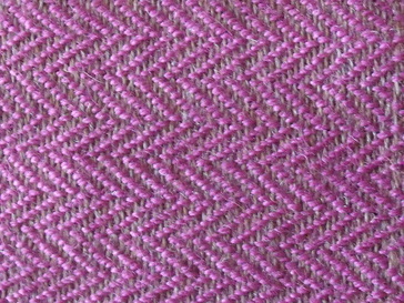
I finished working on my stepmom's scarf last night. I will take photos soon but I probably won't post them until she has received it. I have started to work on another one in the same pattern for sale on Etsy.
I also finished weaving my second-ever woven scarf! It is very short, and will probably be more of a neck decoration than something that keeps the neck warm. It was a bit of a challenge to finish this, as my loom fell apart as I was almost finished and I had to get out the hammer, nails and pliers in order to finish the job. This scarf is also going to be a present, this time to my mom, so I can't show you the whole thing yet. But here is a sneak preview:
I heat-set and removed the glue from two small glue resist pieces I did. They are drying and are not ready to be photographed yet. I also ironed the resists that I washed out yesterday. I am pretty pleased how they turned out. 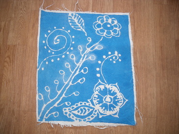 Based on henna designs. I learned not to scrub at the glue with a nail brush: this fades the fabric paint, which is why there are some faded bits around the leaves on the vine. 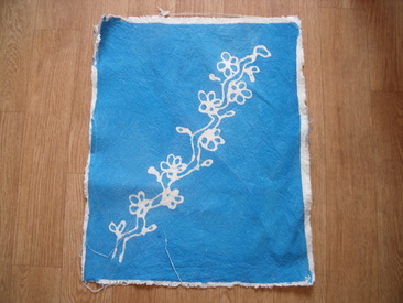 Cherry blossoms, a favorite motif of mine. 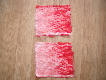 Pole wrap resist. This is apparently a type of shibori dyeing. I also did worked on some more glue resists to try with the textile paint, and I took one of the pole wrap cloths and tried a resist on that. Tomorrow I will put dye on top of it. I'm excited to see how it works. I also did a bit of snooping around last night (because with unschooling school is never in and school is never out) and found out that some of the physical resists I have been doing are shibori. I think I will take a shibori book out of the library, as there are many techniques I would like to try that I couldn't figure out from the internet.
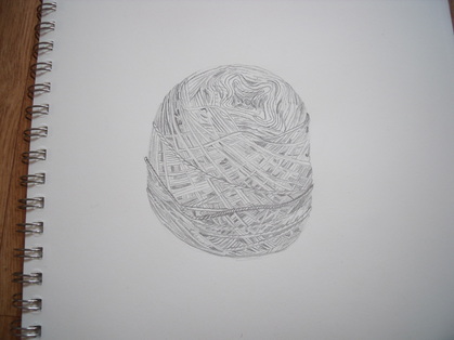
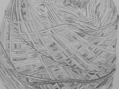
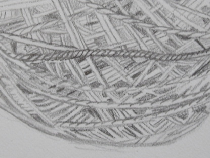
I finished my yarn drawing. It looks a little better now that I've finished it. I have learned that I need to work on my negative space and my shading. I will probably do this by drawing more.
Yesterday, I started out with my new resolution of doing half as much in a day. In fact I did just as much as usual, but much of it included screwing around on my computer trying to download podcasts and photos. I had a look at my product photos. They are a little better than the last ones (you can actually see the shirts) but not very good. Master photographer I am not. I am limited by my point-and-shoot camera, but I have managed to take decent photos with it before, so I think it might be my skill that's the problem. I will need to work on that. 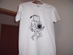 Non-Etsy quality product photo. For my warm-up I was to choose a motif to explore over and over again in my work. I think there is a motif that has found me: leaves. I don't know what it is about leaves, but I keep using them. They all look different, of course. At least most of them. I would have liked for my motif to be trees (which are very symbolic for me) but my trees never really turn out. So leaves it is. For my podcast, I listened to the conclusion of the lecture that I was previously listening to, about craft and social movements in India. Today, there is a lot going on in the world of Indian crafts. Crafts are considered to be part of the heritage of India, but they are generally being replaced with mass-market goods, often from China. Sometimes Chinese mass-market goods are even made to look like Indian crafts! There are special stores, including government stores, who sell Indian crafts, and the growing middle class in India, who want quality products, is a new market for the crafts, as are craft collectors overseas. Some Indian crafts are of exceptional quality, as are the blockprints in this link. Notice how many steps are involved in creating the beadspread. However, some Indian crafts are not of such high quality, and the presenter didn't believe that people should buy the products just because they were handmade. He wanted to work with artisans and his design students to develop better products that would appeal to a larger audience, especially those who want something high-quality and don't care if it's handmade or not. There have been many problems with the artisan community in India. Most live below the poverty line, and people sometimes steal their ideas. The concept of intellectual property rights often a new idea to these people. There have been a number of suicides as people have watched their livelihoods become unviable. Often the artisans are women, who face additional social, economic, and political hurdles. However, artisanship is the second-largest employer in India (the first being agriculture) so it is essential to the economic development of the country. The speaker wanted to help the artisans use crafts to lift themselves out of their poverty and experience dignity. I continued to work on my yarn-ball drawing. It is coming along, albeit slowly. I'm still not very happy with it. Unfortunately, it is the ball of yarn I've been weaving with, and I've run out of yarn on my shuttle, so I can't continue to weave until I've finished the drawing. I don't want any more scenes changing on me before I've finished them! 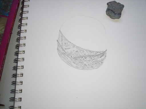 That weird grey thing is a kneaded eraser. 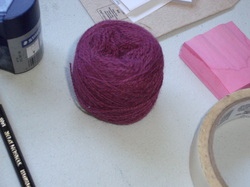 The subject. For surface design, I tried two new techniques: Elmer's school glue resist with watered-down textile paint, and pole-wrap immersion dyeing. I have washed both out now and will post photos when they are dry and ironed.
Today, I started out with business study. I have now estimated all of my start-up costs and most of my monthly costs. The start-up costs are reassuring: I probably won't need a bank loan. However, my monthly costs are scaring me. I have no idea how many transactions to expect in a given day, and there are only two days of sales, and my products will be priced pretty high so I don't know if I'll be selling lots of them. I certainly hope I do! But there's no guarantee. But I suppose I will really only have to make about $200 a day to make those costs, which is one or two sales. If I could make two sales a day at that silly Catholic Church craft fair I attended last year, I could probably make more than that at the Portland Saturday Market!
Design. Oh, design. I wish this book had assignments because I am sucky at coming up with them on my own. Today's chapter was about shape. Shapes can imitate natural forms or they can be imaginary and abstract. There are geometric shapes, which we are all familiar with from elementary school, as well as biomorphic shapes, which suggest natural forms or forces (you could have a shape like a human body, or what you thought the wind looked like). Shapes do not have to have distinct boundaries: they can be suggested through closure, or implied shape. There is also amorphous shape, which is a blurry image which suggests a shape. Shapes can either be two- or three-dimensional, whether in sculpture or a 2-D picture plane. Mass refers to shapes on the picture plane and volume is the empty spaces. Shapes can appear 3-D while on a 2-D surface (plastic). This can be achieved by tilting the shapes in space, foershortening them, overlapping them, or grading the color, value, or texture. This is especially important when representing shapes like spheres or ovoids that do not have any flat surfaces. Use of perspective is one way of making shapes appear 3-D. A weird and cool effect can be created when the perspective lines tilt toward the viewer: it looks like you are looking through the shape. Some artists use 3-D effects without using perspective: medieval artists did not know about perspective, and more modern artists sometimes find it too constricting. Shapes can be used for the same compositional aspects that we previously studied: harmony and variety, either in the shape itself (a repeating motif) or the lines or interior shapes of the image; dominance, or making one shape more dominant than the rest of the image; movement, or the interior lines of viewing the shapes within the image; balance, in which we consider the visual weight of the shape, the negative area around it, the placement, size, and emphasis of the shape. I will continue with the shape composition in my next study.
I hope to continue to work on my stepmom's scarf today as part of my personal projects. I also might go over and review things in my design book to see how well they are actually sticking. The point of all this is to improve my design, after all.
I have a new resolution: I will not try to do everything every day.
I could do it fine for the first few days, but I was getting increasingly tired and less motivated. Also, I didn't have enough time to work on site development, networking, and all that kind of thing. So I am going to give myself shorter studying days with more time for non-studying projects. I also resolve not to be working nine or ten hour days. To some people, it might not seem like a lot, but with my disability, it really is too much.
Yesterday, however, I did do a full day. I didn't intend to, it just kind of happened.
I started out with my podcast. I had some errands to do and listened while I did them. The presentation was by a very distinguished professor in India who talked about how craft has been essential to the Indian identity. He said that in the various Indian languages, the word for "craft" also means "art", "architecture", and various other similar things. This is an idea I can get behind! I am very interested in blurring the lines between art and craft, as I think it's a bit of a false dichotomy, and in some cases it offends my feminist leanings (often, things that men have traditionally done are considered art, and things that women have traditionally done are considered craft. It's not a hard and fast rule, but it is a trend.) He talked about craft from the earliest known times of settlement of the Indus Valley region--of course, evidence of craft is one of the first evidences of civilization. He also discussed how the Mughal Empire brought Islamic-style art to India, as evidenced in the Taj Mahal. Most interesting to me was the association of craft with independence from the British. Early on in British rule, the British cut off the thumbs of weavers so that they would not be able to weave, and Indians would thus have to purchase British cloth. When Gandhi began to envision a free India, he wanted to make sure that British oppression would not be replaced by Indian oppression. He believed that increased self-sufficiency was the answer to that. In order to achieve that increased self-sufficiency, Indians needed to re-learn to produce their own crafts. Gandhi focused on spinning, and taught spinning to his disciples at his ashram and even to Jawaharlal Nehru. He designed his own portable spinning wheel that he could take with him on his travels and even to jail, where he spent a fair amount of time. This is why there is a spinning wheel on the Indian flag today. The flag also has to be spun with the same kind of hand-spun Indian cloth that Gandhi made, as I have just learned from Wikipedia.
Next I decided to experiment with doing an Elmer's school glue resist on cloth. I applied the resist (and used half the bottle, so good thing it's cheap!) and had to wait for it to dry. I also prepared several small pieces of cloth for continued experimentation. But that was all.
I continued drawing my ball of yarn. It continued to drive me crazy. When I look at it with fresh eyes, it's not so bad, but when I work on it for a while, I am acutely aware of how far my drawing has to go. My biggest problems are that I am not very good at estimating negative space, so things always end up in the wrong spot and I don't realize it until I try to fill in the detail, which doesn't match up; and that I don't have a good grasp of shading and value. I do shading, but it never quite looks right. I don't yet have the tools to identify what it is that I am doing wrong.
In design, I finished the chapter on line. Line also possesses character, that is, what type of line is made with the medium at hand, and how it is applied. It could be blurry or sharp, thick or fine, dotted or smudged, etc. There are other elements having to do with line as well. Line and shape involved contours, the outermost limits of a figure, and cross-contour, like what you see on a contoured map. Line and value has to do with types of shading that can be achieved with line. You can do this by controlling how close together the lines are, or by varying the thicknesses of the lines. Putting parallel lines together to create different values is called hatching, and you can achieve darker values by making those lines perpendicular, called cross-hatching. There is also line and texture, which is how the line appears on the surface. This is created by the different media that can be used. Additionally, there is line and color. The color used will change the impact of the line. There are spacial characteristics of line: thick lines appear to be closer and thinner lines seem to be further away. Lines can modulate from thick to thin and have an impact. Line can also represent emotions or states. Gestural drawings are based on an artist's initial impression of something and tend to have loose, flowing lines. There are also calligraphic lines, or lines that imitate calligraphy (but can be used in any typer of art). Additionally, there is implied line, or lines that are suggested by the lines and shapes around them (remember closure?) Finally, there are three-dimensional applications of line: we tend to see lines where there are edges in three-dimensional work. Sometimes lines are incised in clay to bring a certain image out.
Finally, I worked on my business study. My husband and I discussed getting my online shop back up. One of the problems with my shop is that I have horrible pictures, so I re-took pictures of my products. I'm not sure they're any better, however. Master photographer I am not.
Today I endeavor to do half of what I did yesterday. So shorter blog posts, hopefully.
Also, my camera situation has been resolved, and the camera is charged. At the moment, I am loading those photos onto my computer and it is taking a long time, so I will have some new photos later today or tomorrow.
|
 RSS Feed
